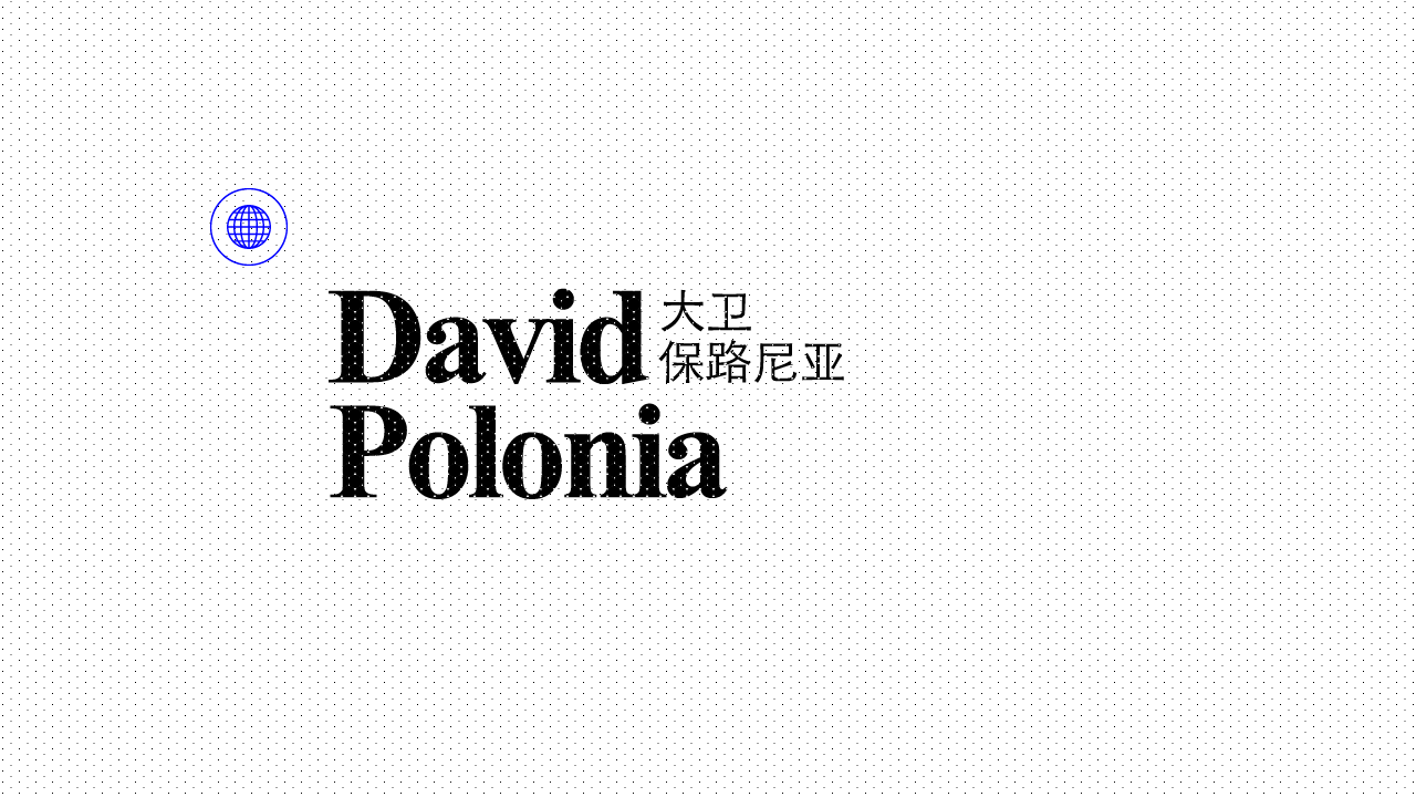
About
David is a Paris-based designer, creative director, art director, graphic & type designer. He specializes in visual identity and holistic cool solutions mainly in the fields of fashion and luxury. Read more
Let's work together
 2009—2010
Freedom
2009—2010
Freedom
After a few years spent working at Marcel, an advertising agency owned by Publicis, I understood that advertising was not really my cup of tea. I felt courageous enough to abandon ship, start a freelancer life and work in a small boutique nested in the 10th arrondissement in Paris. Probably the most beautiful year of my life.
Clients
Chanel, Dior Couture, Hermès, Computerlove.
 2010—2013
Blondie
2010—2013
Blondie
Attracted by entrepreneurship, I founded my first creative agency, Blondie, in 2010 with two partners. We decided to focus on digital-only solutions for luxury, fashion & beauty brands. It was interesting (although a bit destabilizing) to understand that even with worldwide luxury references from Publicis, we were total strangers — read 'amateurs' — for the majority of parisian brands’ CEOs. But thanks to some hard work and big smiles, a few of them trusted us; the first one was Frédéric Biousse, then the fresh new-owner of ready-to-wear brand Sandro. Would follow Jean-Marc Gaucher from Repetto, Henri Sebaoun from Carven, Gerbi family from Gérard Darel & Pablo; which finally opened doors to luxury groups such as LVMH, Coty, Hermès & Chanel Beauty. We were delivering mainly ecommerce websites and funny (but often useless, let’s be frank) apps. The whole team became addicted to grid systems and my friends at Area17 explained me the principle of pixel fitting to me, which I am still a big fan of nowadays. Apart from this adventure, we co-founded L’Exception with Régis Pennel, an interesting way of getting behind the scenes and better understand our clients’ needs, but also to delve into real and holistic art direction: products shootings, lookbooks, packagings, typeface,... everything was handmade without any usual creative constraints except being innovative (and indeed viable in terms of business) which was clearly a revelation to me.
But after three years and a bunch of good and bad surprises, I realised I did not feel that I was in the right place anymore at Blondie: digital projects were cool but a bit too limiting. For most of the brands we worked with, we were tagged as “internet” designers and that was it; I understood it was not going to change and wanted to go back to my first loves: logotypes, typefaces, shapes & curves. I saddly left my beloved team, and started a new adventure.
But after three years and a bunch of good and bad surprises, I realised I did not feel that I was in the right place anymore at Blondie: digital projects were cool but a bit too limiting. For most of the brands we worked with, we were tagged as “internet” designers and that was it; I understood it was not going to change and wanted to go back to my first loves: logotypes, typefaces, shapes & curves. I saddly left my beloved team, and started a new adventure.
Clients
Hermès, Repetto, Chanel Beauty, Chloé, Moët & Chandon, Sandro, Gérard Darel, Carven, Look Collection, Baccarat, L’Exception, Pablo, Roberto Cavalli, Tag Heuer.
 2013—2016
Davide Bellino
2013—2016
Davide Bellino
Managing a studio is a pretty easy thing. Thanks to trustworthy friends and my network, clients are not long in calling me and my new little team. Since then, I have tried to work the less possible with agencies, and clearly prefer talking to the decision makers directly. In this way, the learning curve was clearly awesome; everyday I was allowed to better understand brands’ business issues; and the impact of all that on the quality of my work & ideas now seemed visible. People like Jean d’Arthuys from Maison Lejaby or Lionel Giraud from Vuarnet taught me a lot of things and really helped me to grow and get some skills I still use and twist today.
In the meantime, I met Peter Lindbergh and his team of passionate people to work on his website. I then had the impression that I was in my right place: at the crossroads of creativity and business.
My team was quietly growing too, and I had the sensation that to keep talented people by my side, I needed to be accompanied by someone dedicated to finding new clients & set up a stronger business strategy. The process of finding the right partner is a long one, as mistakes are easily made in these moments: you do not want to lose the vision and values of what you have built from the ground up during many years of hard work.
Clients
Peter Lindbergh, Vuarnet, Repetto, Maison Lejaby, L’Exception, Robert Clergerie, Colette, Tara Jarmon, Sephora, Apologie, Givenchy, Joop!, Chopard, John Lobb, Raphaëlla Riboud, l’Oréal, Christophe Robin, Lancôme.
 2016—2019
Bonjour Paris
2016—2019
Bonjour Paris
After finding my new associate, it was partnering time again. A new name had to be found to get rid of any (past) personal identification clues; the company’s name would become Bonjour Paris (I am still pretty proud of it today), and we started using the word “agency” again (it should have alerted me, hehe). Some clients, like Vuarnet or Repetto, followed us and new ones, like Cartier, Double magazine and Longchamp, knocked on our door.
While working on Vuarnet’s new website, we developed our own ecommerce solution, named Shop Chop, mainly because we were tired of the design constraints of existing platforms like Magento or Prestashop (and probably because we were a bit crazy too). That is how we started working not only with small but also with big brands on e-business topics: Carolina Ritzler, Fauré Le Page, Sessùn or Andrew Gn.
Some pretty big fishes called us on different kinds of subjects: Ruinart wanted to launch a limited edition of an exceptional 1998 Vintage, Le Printemps needed a beautiful online capsule to prepare Christmas, Ralph Lauren had to celebrate the 50 years of the brand... it was cool, I heard my team giving more and more phone calls in english and I must admit I did feel a bit proud about that.
On my side, at the end of the day, I did not feel like my workday was over and I needed to continue working until late to still learn more and more about the shapes of some letters, logotypes from the ground up. I could, on a daily basis, test what I learned discussing with entrepreneurs acting in a ton of different businesses (a respected heritage brand, a pure player of luxury, a crazy jumpsuit stylist) or brand directors or CEOs, like Blandine Franc & Thomas Mulhiez at Degrenne Paris wanting to dive deep into discussions about what a well designed shape can say discreetly but surely about a brand. I felt usefull to these people and feel like I have something to say in the field of branding. Some of them even let me work on the objects they created.
In the meantime, my team at Bonjour Paris benefited from our success and grew a lot. Way too fast for me, actually. By always recruiting in a hurry, the risk is to not recognise yourself in your own home; and paying for a team growing too fast also means accepting clients you would not have talked to more than one minute during a dinner party.
One day, tired of feigning some interest during endless meetings about some cheesy daily Instagram posts, I finally decided to bail out.
Clients
Andrew Gn, Carolina Ritzler, Cointreau, David Mallett, Degrenne Paris, Double Magazine, Duvelleroy, Fauré Le Page, Hermès, Repetto, Longchamp, Louis XIII, Cartier, Moët Hennessy, Nose, Printemps, Ralph Lauren, Roger Vivier, Ruinart, Sessùn, Y.
 2019—∞
Freedom, again
2019—∞
Freedom, again
Here I am, free again. Free to work on projects I really like, with the many passionate people surrounding me. I am now able to show all the work you will discover on this website with a bit of humor, some nice songs & a few insights on the way I created them. Enjoy your visit, thank you for being here.


 Choose the way you want to enter below
  Dans la peinture, la sculpture et tous les beaux-arts, l’essentiel c’est le dessin... le goût ne doit pas être basé sur ce qui flatte la sensation, mais sur ce qui plaît par sa forme. Les couleurs qui illuminent l’esquisse font partie de son attrait ; elles peuvent animer l’objet mais ne peuvent pas le rendre beau et digne d’être contemplé ; au contraire, elles sont limitées par les exigences d’une belle forme et même, quand l’attrait existe c’est la forme qui ennoblit.